
After several months of work, I’m proud to finally announce
- Improved text analysis to help readers study sentences that they are struggling with.
- Completely reworked the UI to improve usability, and a better time browsing.
- Auto-generated Anki decks for each of the comic series based on the translations (these update each time a new page is added).
- And lots of other backend improvements!
Major Features
Text Analyzer
The major feature of 0.1.0 is JapaneseAnalyzer.
This feature takes Japanese text as input, and spits out structured linguistic information linking text to definitions found in a dictionary.
In the past, I used to have to do this manually, by providing a map that says which words map to which definitions (and where those words are in the sentence).
I also had to manually provide the for any present in the word.
Here’s how a line from the old generator used to look:
- speaker: "谷崎ゆかり"
  text:
    jpn: "{私:わたし}<が>{{三}{組}:さんくみ}<の>{担任:たんにん}<の>{谷崎:たにざき}<です>!"
    eng: "I'm class 3's homeroom teacher, Ms. Tanizaki!"
  vocab:
    - text: "私"
      lookup: ...
    - text: "三"
      lookup: ...
    - text: "組"
      lookup: ...
    - text: "担任"
      lookup: ...
  grammar:
    - text: "が"
      lookup: ...
    - text: "の"
      lookup: ...
    - text: "です"
      lookup: ...
  nouns:
    - text: "ゆかり"
      lookup: ...
The very same sentence, using the new text analyzer, looks like this:
- style: !Dialogue
    speaker: "谷崎ゆかり"
  lines:
    - jpn: "私が三組の担任の谷崎です!"
      eng: "I'm class 3's homeroom teacher, Ms. Tanizaki!"
So, in this case, it’s no different from just typing the sentence out normally.
There are cases where I need to “help” the analyzer, but we’ll save the details for a later blog post. There’s a lot to talk about here. I learned a lot about the Japanese language, and about parsing natural languages in the process.
Improved UI
There have been several improvements to the UI.
| Old UI | New UI | |
|---|---|---|
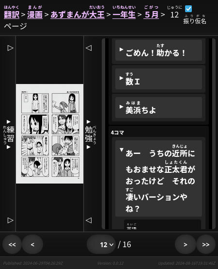 | ⇨ | 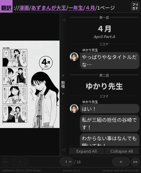 |
I was never really happy with the old UI, I thought it was pretty ugly. But the new UI, though not perfect, feels to me like a step in the right direction.
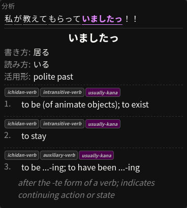
Improved Analysis Panel
Now you can see an example of the sentence you’re reading, and you can click words to expand them and see information like definitions, usages, and forms.
You were able to see definitions in the old UI as well, but now you can see a lot more information, and that information is organized in a better way.
Fullscreen Study Sidebar
You could actually do this in the old UI too. But since it wasn’t super obvious (and now I can create update posts), I wanted to mention it here.
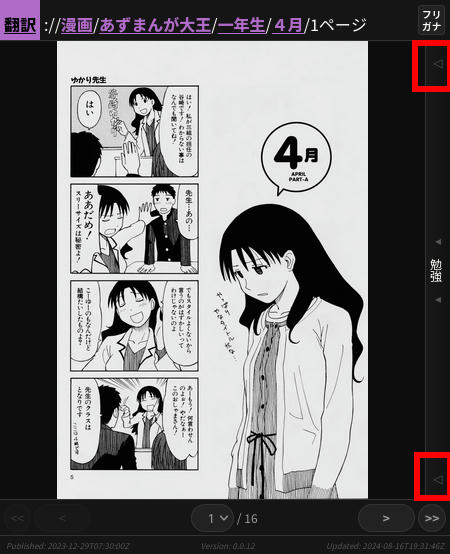
If you press the larger arrows on the sidebar handle, it will expand to the whole screen, instead of just half of it (press them again to minimize).
This can be really handy on mobile devices.
| Minimized | Maximized | |
|---|---|---|
 | ⇨ | 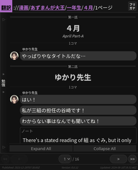 |
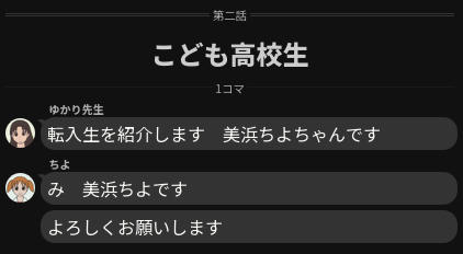
Speaker Indicators
The new UI allows us to surface data relating to who is talking, and the way they are talking (to a limited degree). This makes it clear to see at a glance important context information about a line of text (such as who is talking, is it speech, or a thought, is it a sound, etc).
Anki Decks
The old UI used to provide an in-browser flashcard feature.
This was pretty ugly, and frankly not very useful. If you wanted to practice you had to visit the site and manually remember to practice.
A tool that many language learners use is Anki, it allows you to download and make your own flashcards, and then it serves them to you using a Spaced Repitition System (SRS).
The new site produces Anki cards on a series-level, so you can download all of the words the analyzer found (excluding proper nouns for obvious reasons).
You can download the Anki deck for Azumanga Daioh here!
Minor Features
There’s a number of other changes, but they don’t all deserve to be highlighted.
Many of them just improve backend processes that the reader will never see. For transparency, here’s all of the changes that I can recall:
- I can now create small update posts and publish them.
- Translation analysis is now cached and HMAC’d, to ensure that a page cannot change how it generates without needing to be re-reviewed.
- Content that hasn’t changed, wont lead to pages being re-generated.
- All Japanese text in the UI is also processed through the text analyzer.
- One limitation here is that any notes and blog posts currently aren’t analyzed. I’ll have to fix this in the future.
- Section headers (ex. , , etc.), stick to the top of the view. As you scroll around you can always tell which part of the story you’re in.
- You can scroll past the end of the study sidebar now. This is to help you position text where you want vertically on the page (for studying).
- Since the Anki deck is replacing the custom flashcards, there is no longer a left sidebar.
- The profile when analyzing a proper noun (like or ) now includes a picture, along with a brief set of other names they go by.
- Notes can be attached anywhere in the flow now, at any level.
- Added buttons so that you can expand or collapse all word bubbles.
What’s Next?
There’s a ton left to do, but this should make my week-to-week easier in the meantime. I don’t really want to say what I’ll be doing next though, because it’s kind of fun surprising y’all.
Happy language learning! :)